
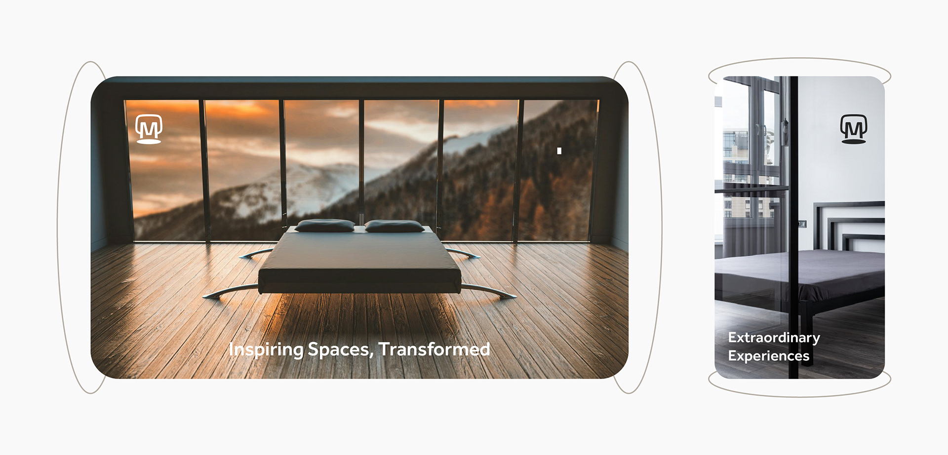
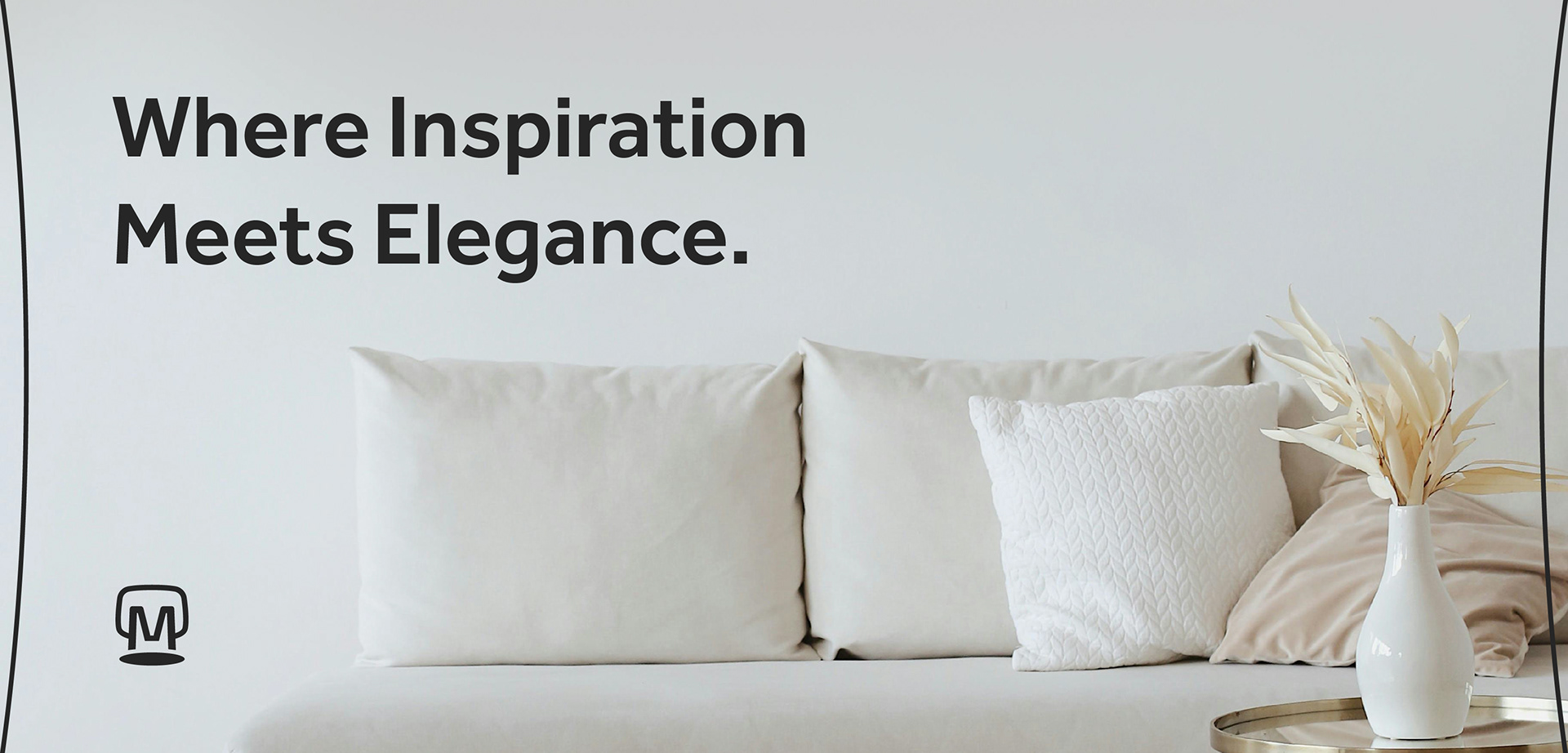
Moodboard: Designing Spaces That Inspire
Moodboard is an innovative interior design brand dedicated to crafting thoughtful, inspiring spaces that enhance the way people live and work. With a team of talented designers, Moodboard combines cutting-edge creativity with a deep understanding of design principles to transform ordinary environments into extraordinary sanctuaries.
Moodboard's design process is rooted in close collaboration with clients, blending their unique preferences and lifestyle needs with expert insights. From conceptualization to execution, Moodboard guides customers every step of the way, ensuring their vision materializes seamlessly.
Whether clients are looking to refresh a single room or reimagine an entire property, Moodboard's expertise in space planning, color theory, and material selection will elevate the living or work experience.
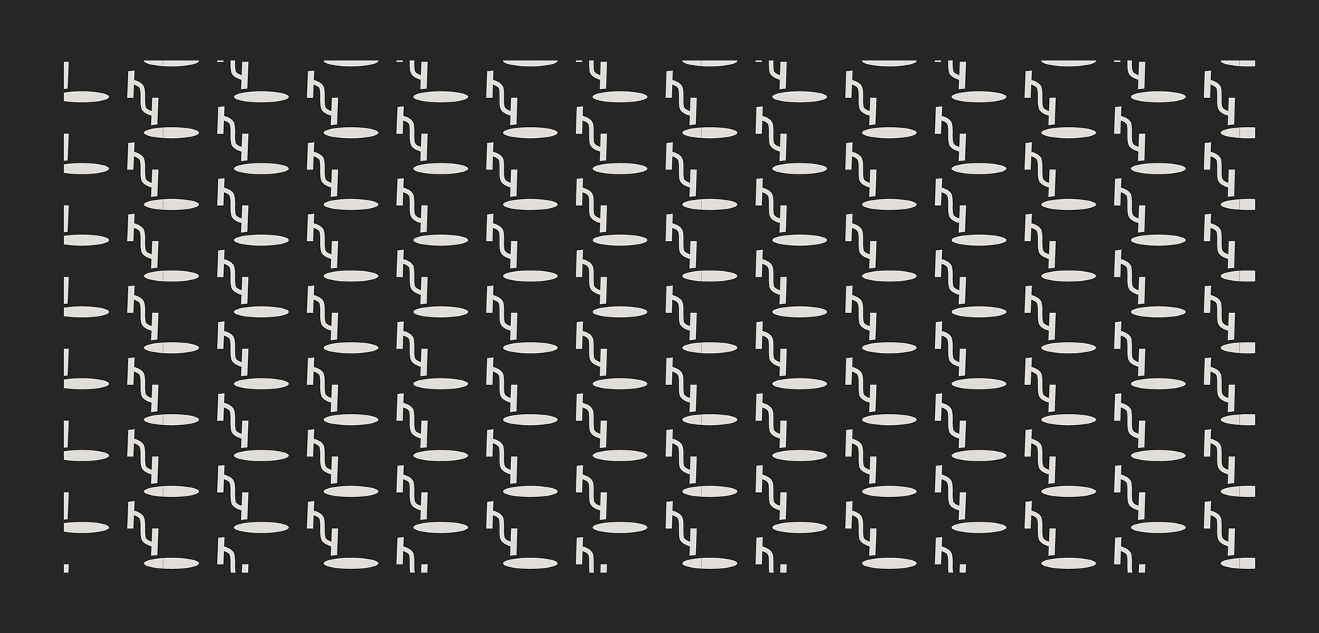
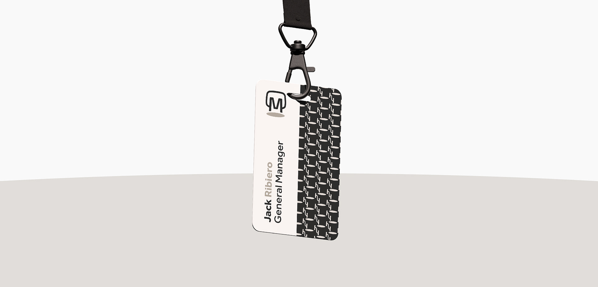
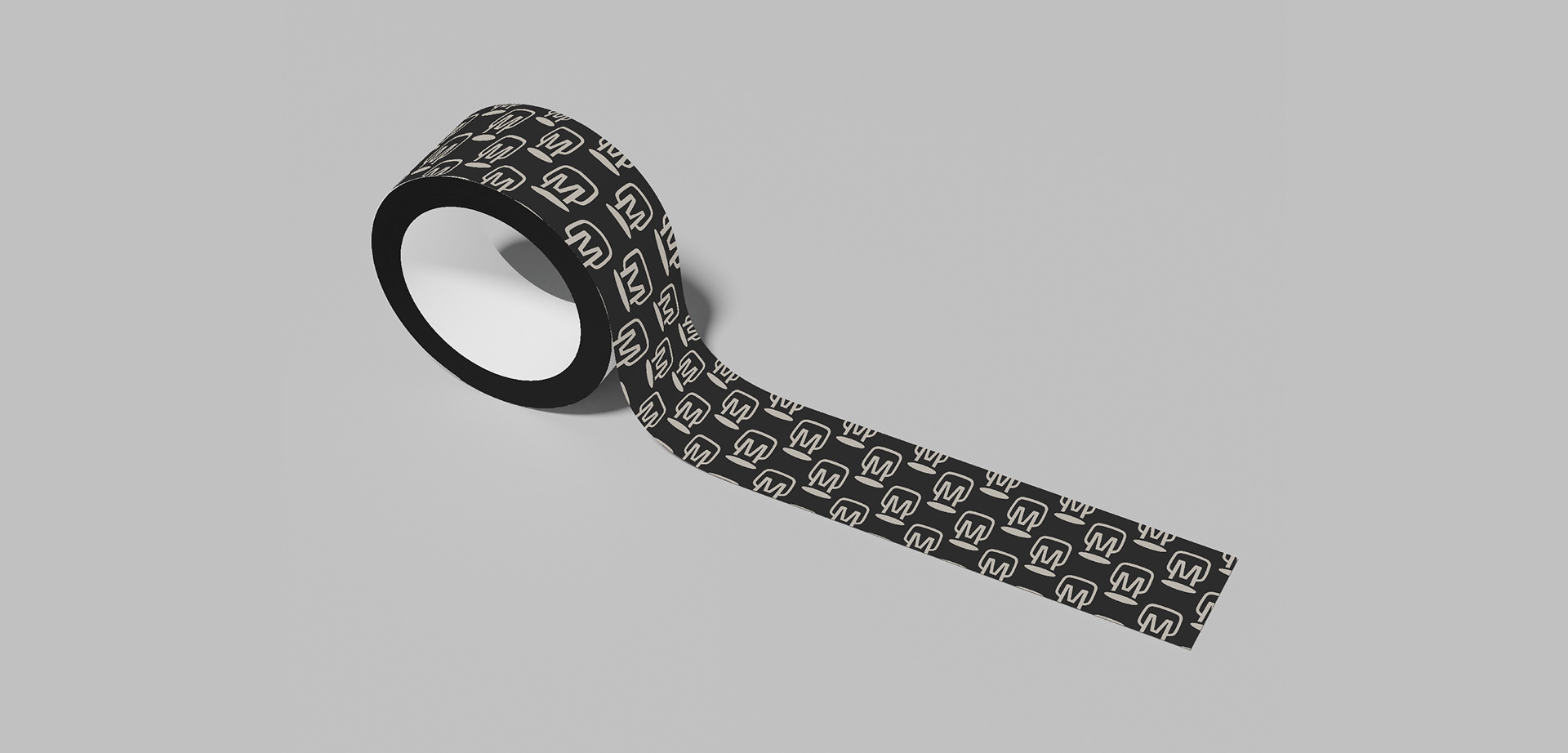
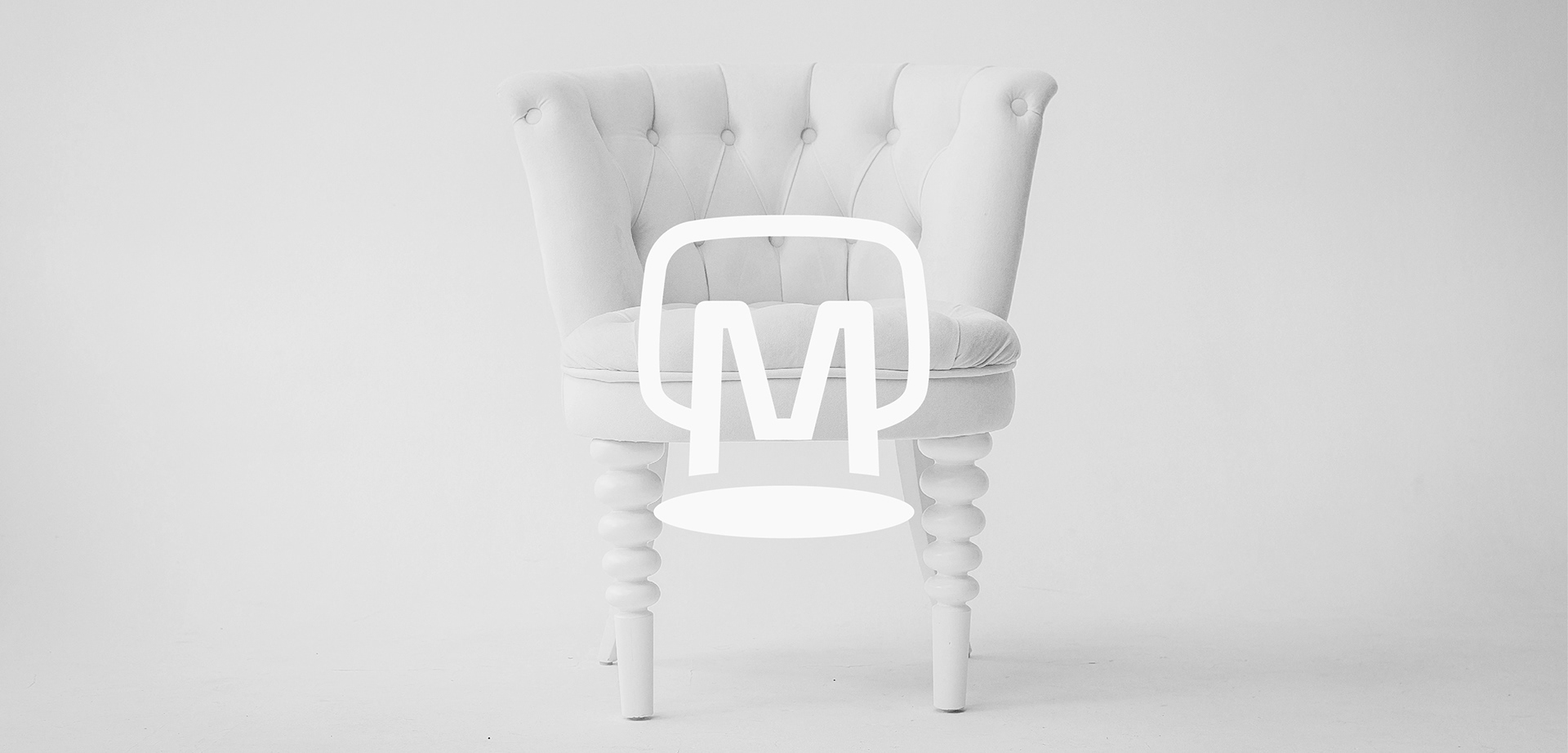
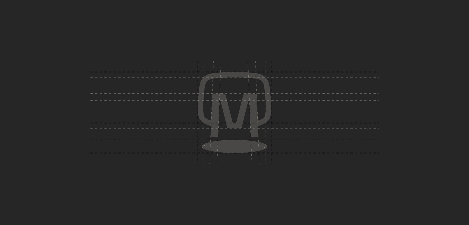
The Moodboard logo cleverly incorporates the letter "M" into the shape of a stylized chair, perfectly encapsulating the company's expertise in interior design. This striking visual representation serves as a subtle yet impactful symbol, inviting clients to take a "seat at the table" of Moodboard's design process.
The chair-shaped "M" not only references the core of Moodboard's business – transforming spaces through thoughtful interior design – but also suggests an invitation to collaborate and be part of the creative journey. It reflects the company's commitment to crafting personalized solutions that reflect each client's unique preferences and needs.
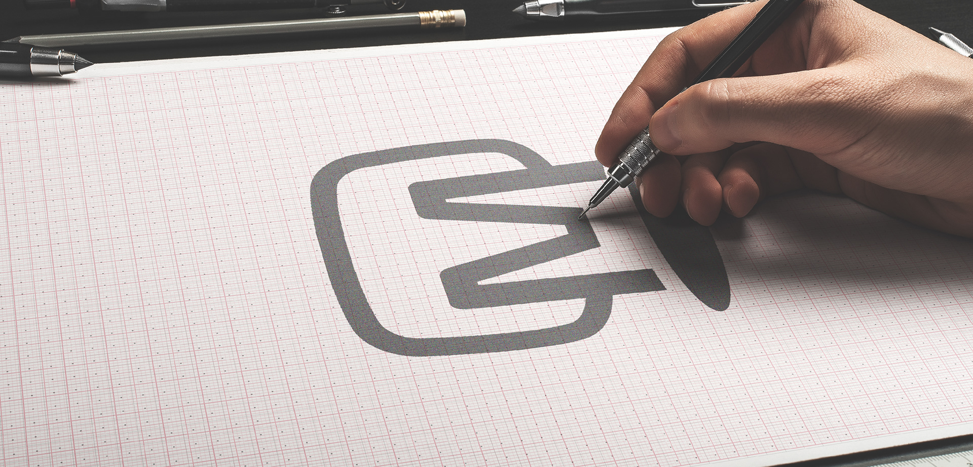
Bringing the Logo to Life
Using freehand sketching techniques, I experimented with various chair silhouettes, angles, and proportions to ensure the final form would be instantly recognizable as both a chair and an integrated letterform. This exploratory sketch process allowed for rapid idea generation and refinement. Once the concept was finalized, the logo was meticulously vectorized
Choosing the Perfect Typeface
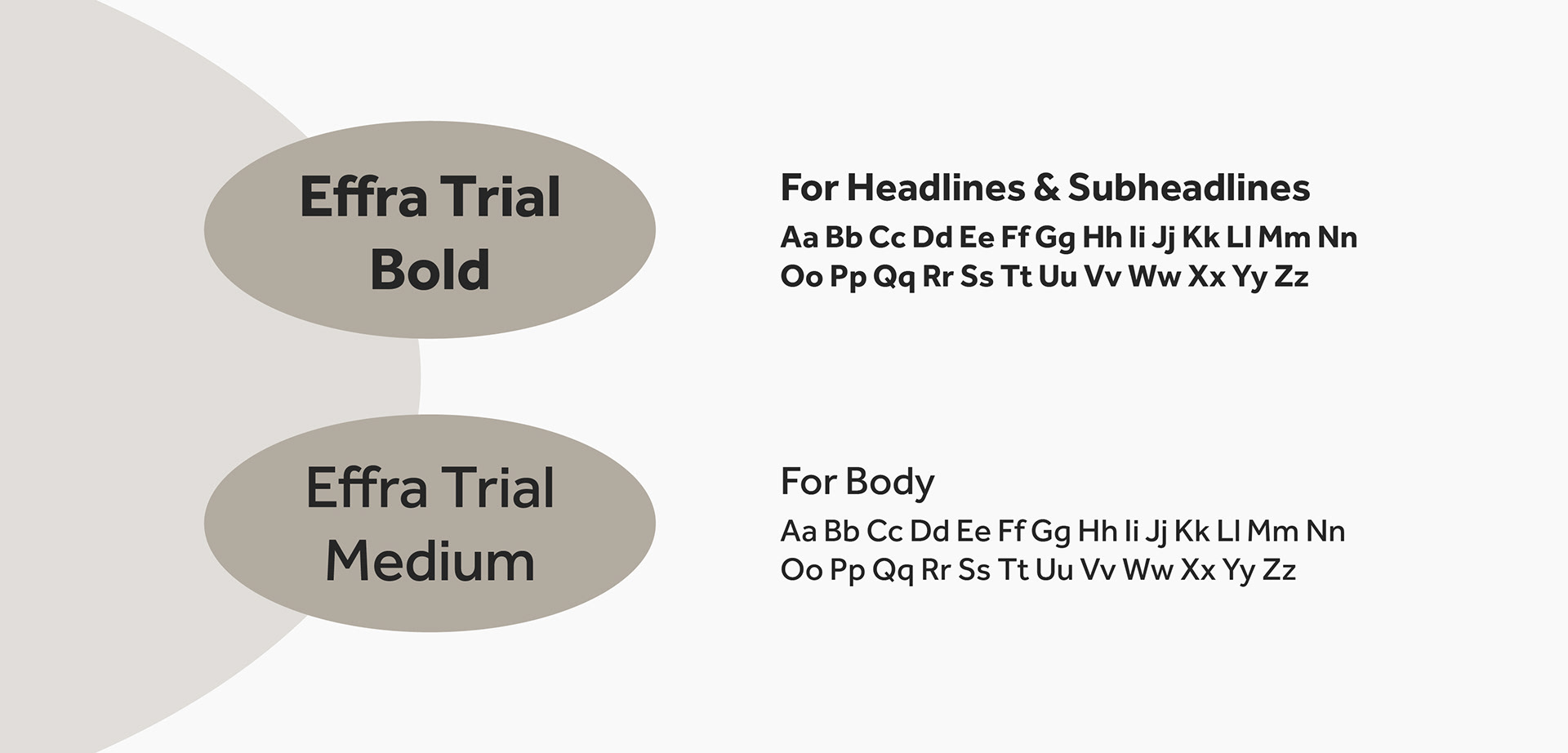
After establishing the iconic chair-shaped "M" as the central visual element of the Moodboard logo, I turned my attention to selecting the most complementary typeface for the logotype.
Recognizing the importance of typography in creating a cohesive and memorable brand identity, I experimented with a variety of font styles, ranging from modern sans-serifs to more traditional serif options. Each typeface was carefully evaluated for its ability to harmonize with the chair-shaped "M," ensuring the overall logo would convey a sense of sophistication, elegance, and design expertise.
I paid close attention to factors such as letter spacing, stroke width, and overall visual balance, meticulously refining the logo until the perfect typeface was discovered. This iterative process allowed me to explore a range of typographic possibilities, ultimately landing on a clean, modern font that beautifully accentuated the chair-shaped "M" without overpowering it.

Color Palette
The Moodboard color palette was carefully curated to reflect the brand's core values of sophistication, timelessness, and versatility. Recognizing the importance of color in establishing a distinct visual identity, the I embarked on an extensive exploration of hues, tones, and combinations that would best complement the brand's logo.
Given Moodboard's focus on interior design, I sought to create a color scheme that would evoke a sense of refined elegance, while also remaining adaptable enough to work seamlessly across a wide range of design applications - from printed materials to digital interfaces and environmental graphics.